03.03.2025 20:30
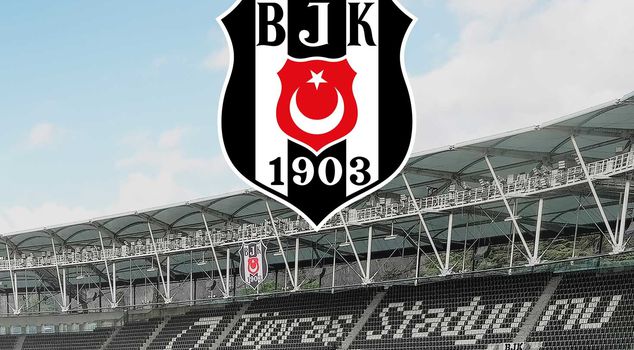
Beşiktaş, celebrating its 122nd anniversary, announced that the club's emblem has been renewed. The renewed emblem was drawn over the old design, and the size of the Turkish flag has been enlarged. Additionally, the letters 'B', 'J', and 'K' as well as the numbers '1', '9', '0', and '3' have been adjusted to the same size and thickness to ensure typographic consistency.
```html
Beşiktaş, celebrating its 122nd anniversary, announced that the club's emblem has been renewed. The black-and-white team made minor changes in the current design.
BEŞIKTAŞ'S EMBLEM HAS BEEN RENEWED
The statement from Beşiktaş is as follows;
"Our glorious emblem has been renewed considering today's branding standards, in order to better reflect our club's brand value and to be used with more distinct lines in digital environments and print applications.
CHANGES MADE
During our 122nd anniversary, the renewed emblem presented to our fans includes the following adjustments:
The renewed emblem was drawn on the same form as the emblem we have used until now.
The Turkish flag, which we have proudly carried for 122 years, has been enlarged. As a result of placing the flag at the boundaries of the black column at the corner points, it gained a more harmonious appearance with our emblem.
The red color in the Turkish flag on our emblem has been adjusted to match the tone of the official Turkish flag.
The black contour on the outer edge of our emblem has been thickened. The black contour, which has been made the same thickness as the white contour, has gained a more distinct appearance.
The letters "B", "J", and "K" have been made the same size, and the numbers "1", "9", "0", and "3" have been made the same thickness to ensure typographic integrity."
```